Week 11 : All About Integration
This week was focused all on integrating the AI into the app and making sure that the one-click-training works correctly. We also focused on creating a new version of the app with reduced complexity as a result of faculty feedback we received indicating that our app can feel a little overwhelming as a result of the complexity. Lastly, we also focused on some UI design for the data visualization.
Testing Using AI
The main idea behind the project is to facilitate playtesting. In past weak, we reached a stage with the AI where it is performing quite well and it can be integrated into the app as a playtesting entity.
This week our goal was to finalize the intergration to the point where the build can be sent our to others for testing.
The flow for getting this done involves 3 stages:
- Creating a Deck : The first step is to create a deck using the available cards (you can create your own cards as well). This is where the game designer’s expertise comes in. A deck can be very strong or weak depending on the cards it has.
- Training the AI : Once the deck has been created, an AI agents needs to be trained using Reinforcement Learning. This process takes significant time. The recommended number of iterations to train for to get stable winrate is around 10,000-15,000. The improvements after 15,000 iterations are marginal because the model gets stuck asymptotically. 15,000 iterations may take anywhere between 7 to 8 hours.
- Playtesting with the Trained AI : Once the AI has been trained, you can playtest with it. To generate sufficiently large playtesting data, you need to allow the AI to play for 2000 games or more. This may take somewhere around 10 minutes. The final result of playtesting are the graphs and metrics that are visualized for ease of interpretation. We will get into the details regarding that in the following sections of this blog post. Depending on how strong or weak your deck was, the AI will come up with data reflecting the same.
New Version of the App
This week, we worked on redesigning the entire app to make it easier to use and understand. The goal is to keep the functions comprehensible for new users.
Workflow of the ‘Basic Mode’
We segregated features of the app into basic mode and advanced mode.
In basic mode, there is a very straightforward workflow: design, train and playtest. A picture of how this looks is below:

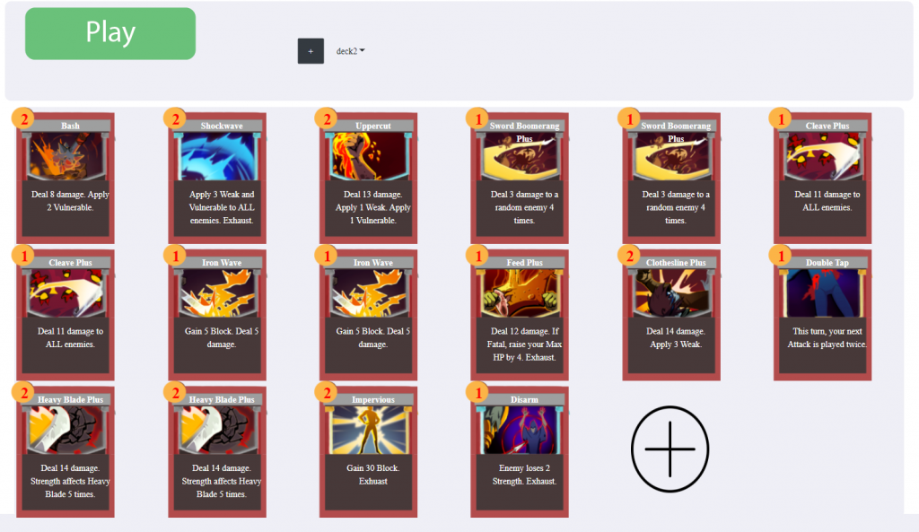
Features in the Design Section of the Basic Mode
In the design part of the basic mode, you can:
- Switch between current decks
- Add/remove cards from a deck
- Create a new deck
- Play your designed game in Unity
An image of this is shown below:
Features in the Train Section of the Basic Mode
We allow the user to select how many iterations to train for. Then just by simply clicking a button, it will connect to our AI module to train the AI on the currently selected deck/game.
This can happen because all our code about AI and gameplay are designed as generalized frameworks in the first place! An image of the training section is shown below:

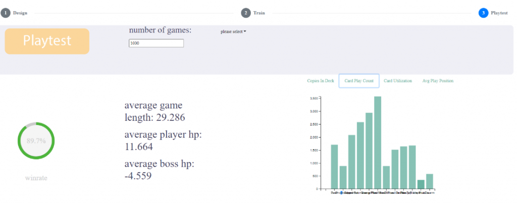
Features in the Test Section of the Basic Mode
Playtesting is as easy as training the AI agent and is much faster. You can select a trained AI agent and playtest using it to quickly generate data and visualize it. The following is a picture of our current test section.
Practice with the Web GUI
We implemented the whole basic mode within a single week. By using the web techniques available in electron, we can change the layout and functionality of the UI efficiently.
Compared to UI systems we worked on before(such as Unity’s UI), we find the combination of css, bootstrap and jquery is very powerful in our development process.
How does this help us?
- Responsive UI : HTML has very good support for responsive UI in different sizes and resolutions. With the grid system in Bootstrap, our UI always looks good no matter how the window size is modified.
- Flexible UI : HTML has the concept of DOM; it organizes UI elements in a tree-like structure. This allows us to modify dynamic UI elements and change UI layout efficiently
- Stylized : CSS has a very decoupled and flexible way to change style.
- Built-In interactions : Bootstrap has many built-in interactions, such as modals, sliders, collapse, dropdown, etc, which cover most of our needs.
Disadvantages
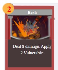
- Hard to build UI out of the framework : These techniques are very hard to use if the goal is to create UI which cannot be described in existing elements, such as buttons, divs, etc. For example, when we try to render the card with dynamic information from the database, we need to manually tune a lot of the CSS properties.
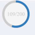
- Pool animation support : Compared to game engines like Unity, web techniques have a bare-bone animation support. For example, even a simple round progress bar shown below takes a lot of work because of the poor key-frame mechanism.
Infrastructure of our Build
As mentioned last week, we don’t have good infrastructure to support our multi-platforms build process. This week, we have made it organized and easy to configure.
Problems we were facing
- Manual operations : Every time we build our app, there are some manual configurations and operations. While we make builds frequently, this is not only inefficient, but also causes many bugs.
- Messed up Build and Development code : A lot of behavior and code is different, especially when it comes to file paths. Sometimes in order to simulate how it works in the build, we switch the code back and forth between the latest code and those in previous builds.
Solution
- Automate the build procedure : We put all build relevant information in one file like config.json. Then we wrote some scripts to create the final build based on these configurations.
- Divide project into build mode and develop mode : We encapsulated all operations having differences in development and build modes. Then we can switch between different modes with the configuration file very easily.
Challenges with the Build
An issue with the build we found this week was with the Windows character limit for file paths. Tensorflow creates a long file names for some of its files that store variables and it can cause some unexpected errors because of the windows limit being violated.
It took us a long time to figure out what exactly was causing the error because nothing explicitly pointed to a problem with long file paths. Once we did figure this out, we reduced the lengths of the folders that store these tensorflow models as much as possible. However long file paths are still an issue for us and we are yet to think about a good way to ensure this does not happen in the future.
Card and Deck UI in the Advanced Mode
The more complex features of our app have been bundled up into the ‘Advanced Mode’ which is a more complex counterpart of the Basic Mode. This week also saw some major redesigning of the Advanced Mode.
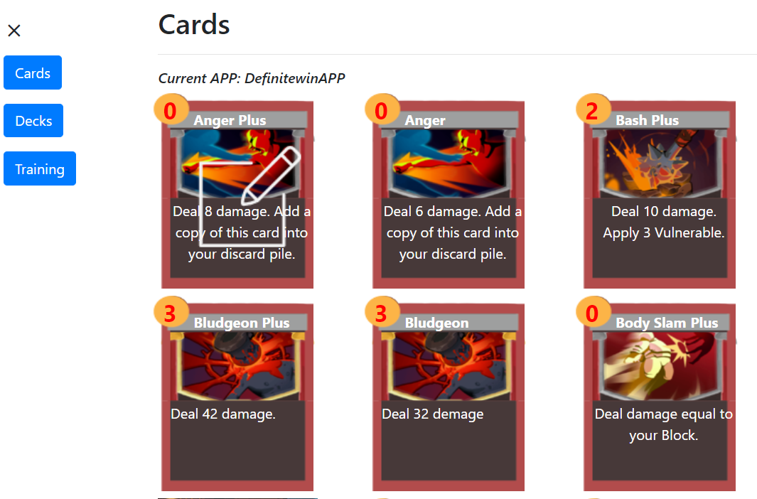
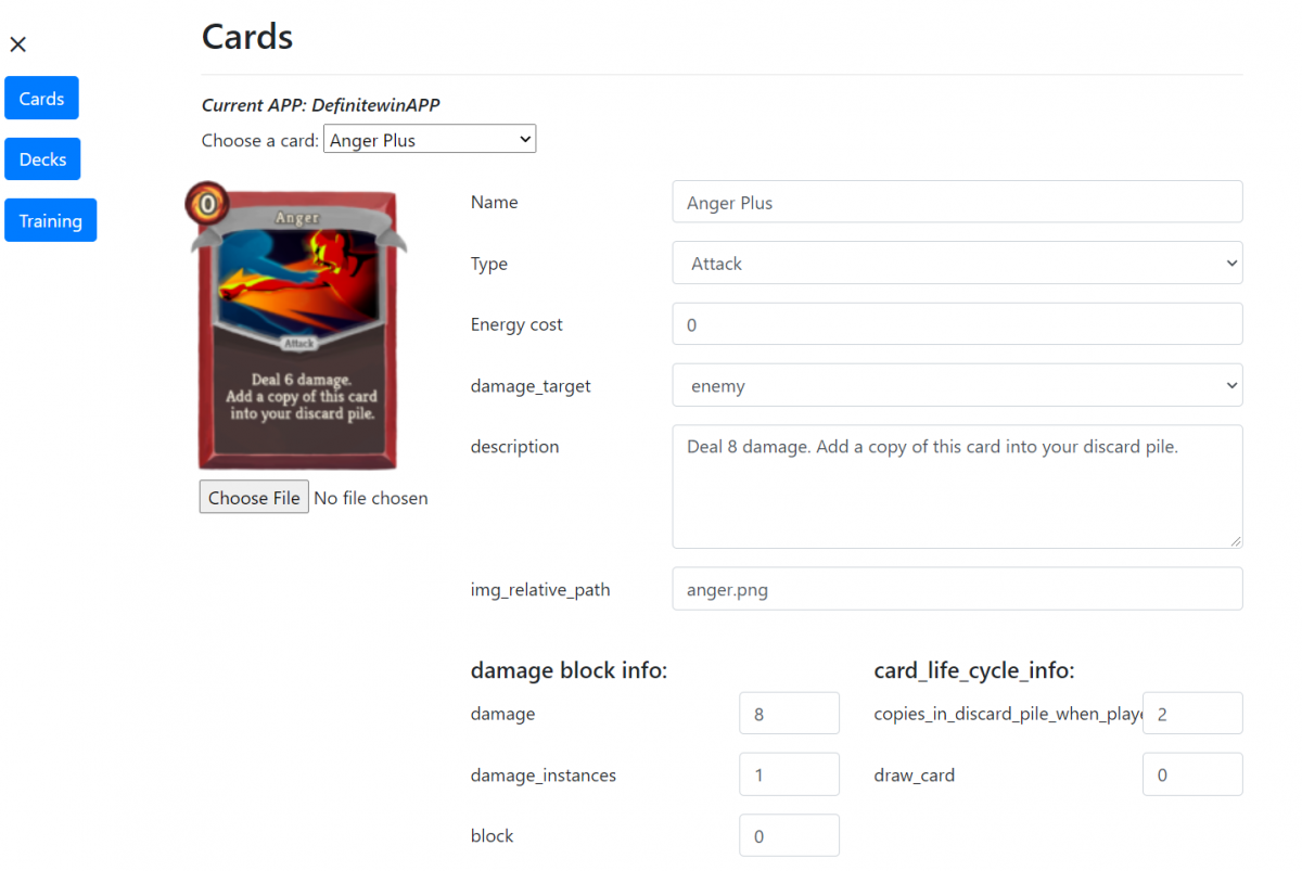
We restructured the UI in advanced mode by using Bootstrap, mainly in the card edit page and the card list page. The left side is a navigation bar to make users navigate through other pages. We made the card editing functionality by clicking on the card images to make it more intuitive.
Below are some pictures of the redesigned UI:
Playtest Plan: Video and Survey
We planned to launch our playtest video and survey this week. Due to multiple challenges that we face on development, we failed to create our build on time. We believe it is better to leave this part for now, and come back to playtest after we finish most of the app functionality. Some materials may be used to create our trailer video/project intro video.
Data Visualization Mockups
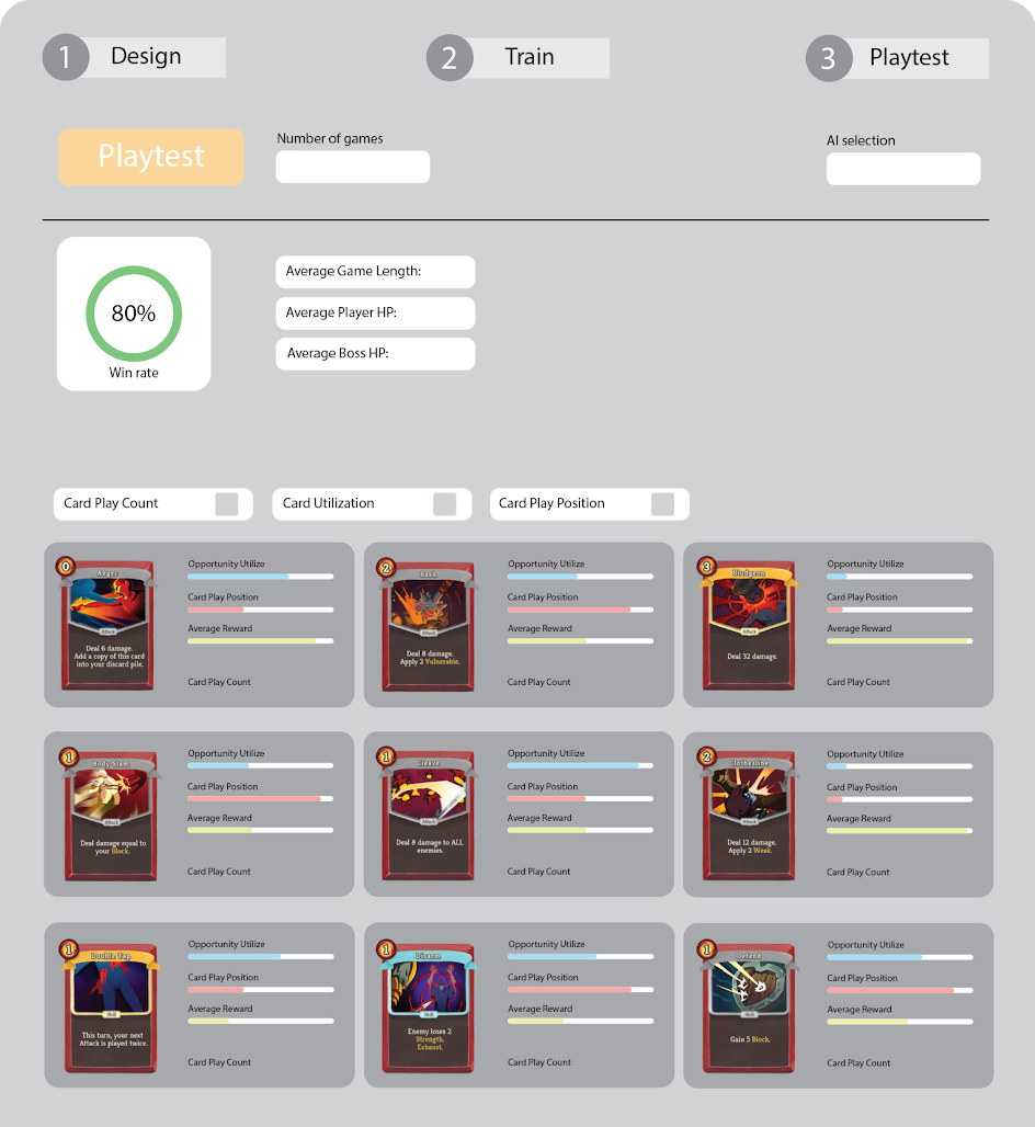
Below are some screenshots of some mockups of how our data visualization (generated in the testing stage) should ideally be presented.
- Basic Playtesting Data:
- Average game length : shows mean, mode, max and min.
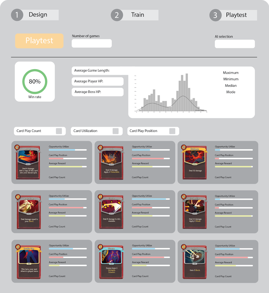
- Card Utilization : Broken down by different game periods; First quarter, second quarter, third quarter and the last quarter.
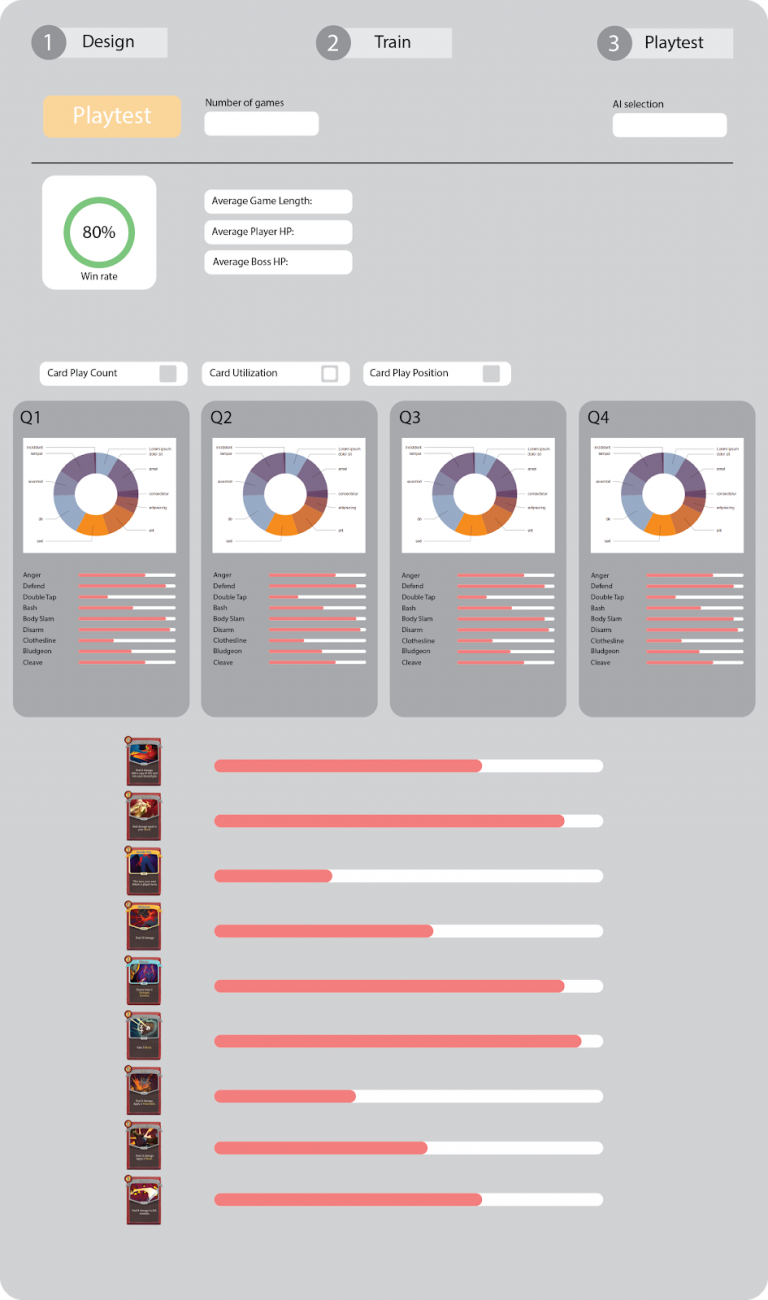
- Card Play Position
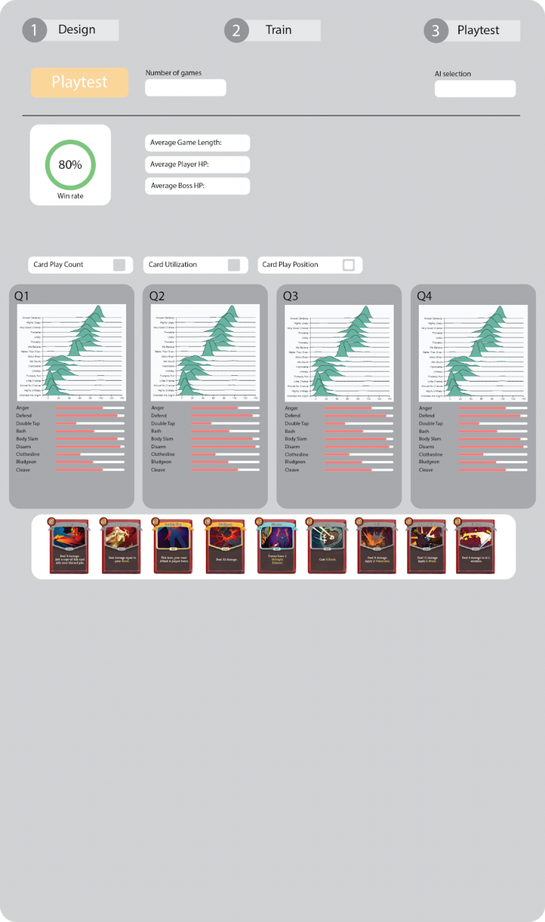
All in all, this week everyone was involved in working on the app. The design changes makes the app look much more accessible. We want to ensure that we place it in the hands of designers to see where they take it.