Week 13 : Preparation for Softs
This week involved more polishing of our app in order to prepare for softs. We identified several bugs through the course of last which needed to be ironed out. We also added some minor features aimed at improving user experience. Last but not the least, we also worked towards creating a couple of videos explaining the objective of our project and showing a demo of our application. The videos will be posted on this page towards the end of this blog post.
New Features
The following are some of the new features we added this week :
Editing Game Attributes
Along with deck/card editing, we also want to allow designers to modify other parameters to change the game’s rules. As a part of the basic mode, designers can now modify the player hp and boss hp.

Details of how this is implemented are as follows:
- Read value from database to show the current values
- Highlight the value if user changes it
- Show “Save” and “Undo” button if user changes the value
- When“Save” is clicked, modify the value in the database and refresh the page
- When “Undo” is clicked, recover the previous value, and remove the highlight
Win Rate Tracking (Train Step)
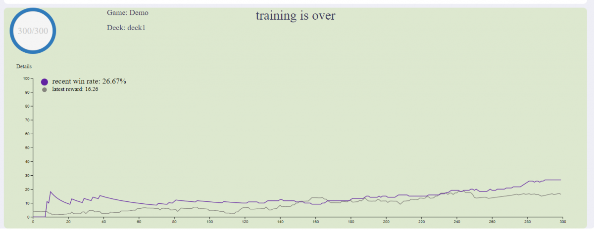
In order to let users know what’s going on during training, we decided to display a dynamically changing win rate curve on the dashboard.

Details of how this is implemented are as follows:
- Calculate win rate in the python backend and send it to electron during training
- Add visualization code to show two curves with different color in one graph
- Maintain the historical win rate and draw the curve dynamically
- Show latest win rate value with numbers on the graph
User Experience Improvement
Following are some of the user experience improvements we made this week:
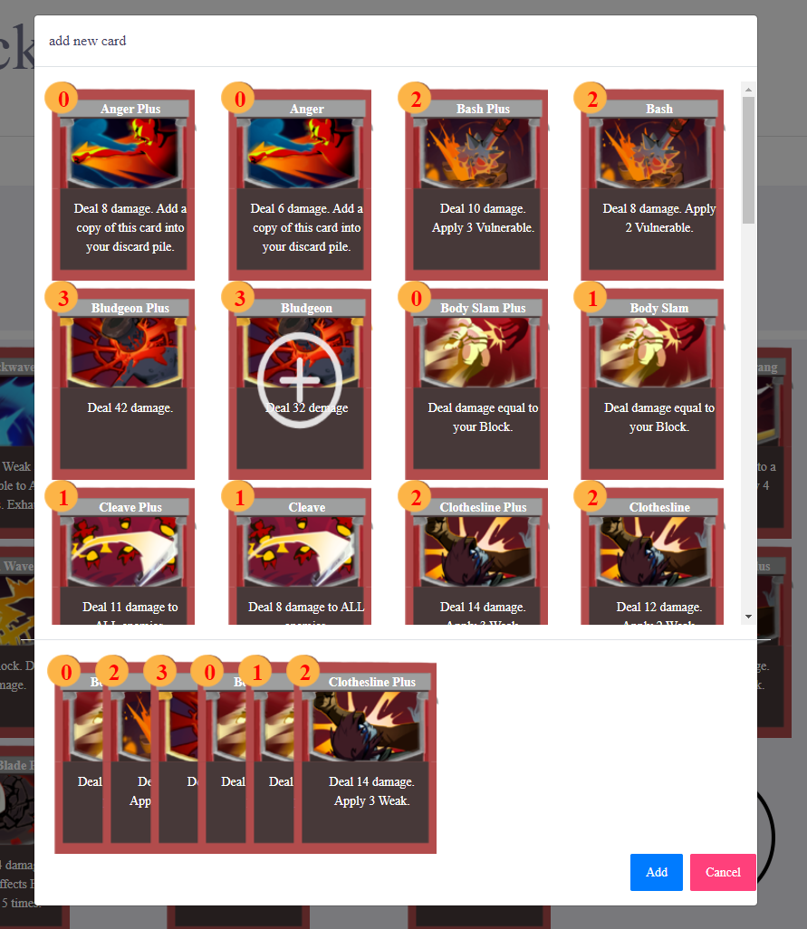
Implementation of a new UI for adding a card to a deck
Here’s an image of how card adding looks after the update:

Here’s how it works:
- All available cards are listed in a grid display
- Displays “Add” icon during mouse hover
- Add cards to a temporary list when clicked
- Display all current selected cards to add
- When the “Add” button is clicked, add the selected cards to deck
General UI Polishing
Here are some UI changes we made this week. Screenshots of these changes are shown in this section.
- Reorganization of the hierarchy in the data visualization section
- Make game settings and deck switching more accessible
- Change in UI styles,layout, font size to make information appears cleaner and easy to read


Polishing the Create/Edit Card Section (Advanced Mode)
Following are some changes that we made to the create/edit card section:
Tooltips
There are more than 15 configuration options available for designers to tweak in the create/edit card page. There are 5 input fields in the main area, and 3 input fields in each of “damage block info”, “card life cycle info”, and “special modifiers info” area.
We decided to provide tooltips when users hover over input labels so that users can know the definition of each input field. We referenced our tooltip information from Slay the Spire wiki. For example, the definition of energy cost is “Energy is the resource used to play cards. The energy cost of a card is at the top left and typically ranges from 0-3.” Also, for the buff info, we gave a link to the Slay the Spire wiki to reference all the buff information.


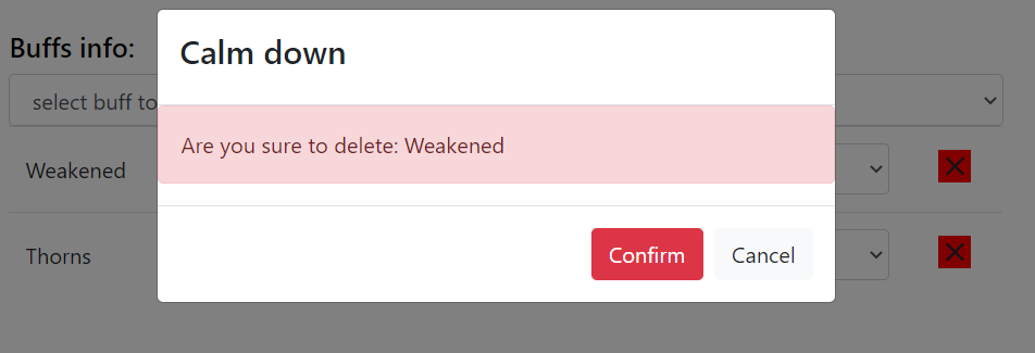
Delete Card Confirmation
One feature we added is the delete buttons for buffs information. After users click on the delete button on the right hand side of buff information, a pop up window will appear for final confirmation.

Videos
As mentioned, here are the videos we created this week when preparing for softs:
Project Introduction Video
Application Demo Video
In conclusion, we got a lot done this week despite the Thanksgiving Break. We will now work more on polishing the app and creating a robust documentation of all the work we did during the semester.